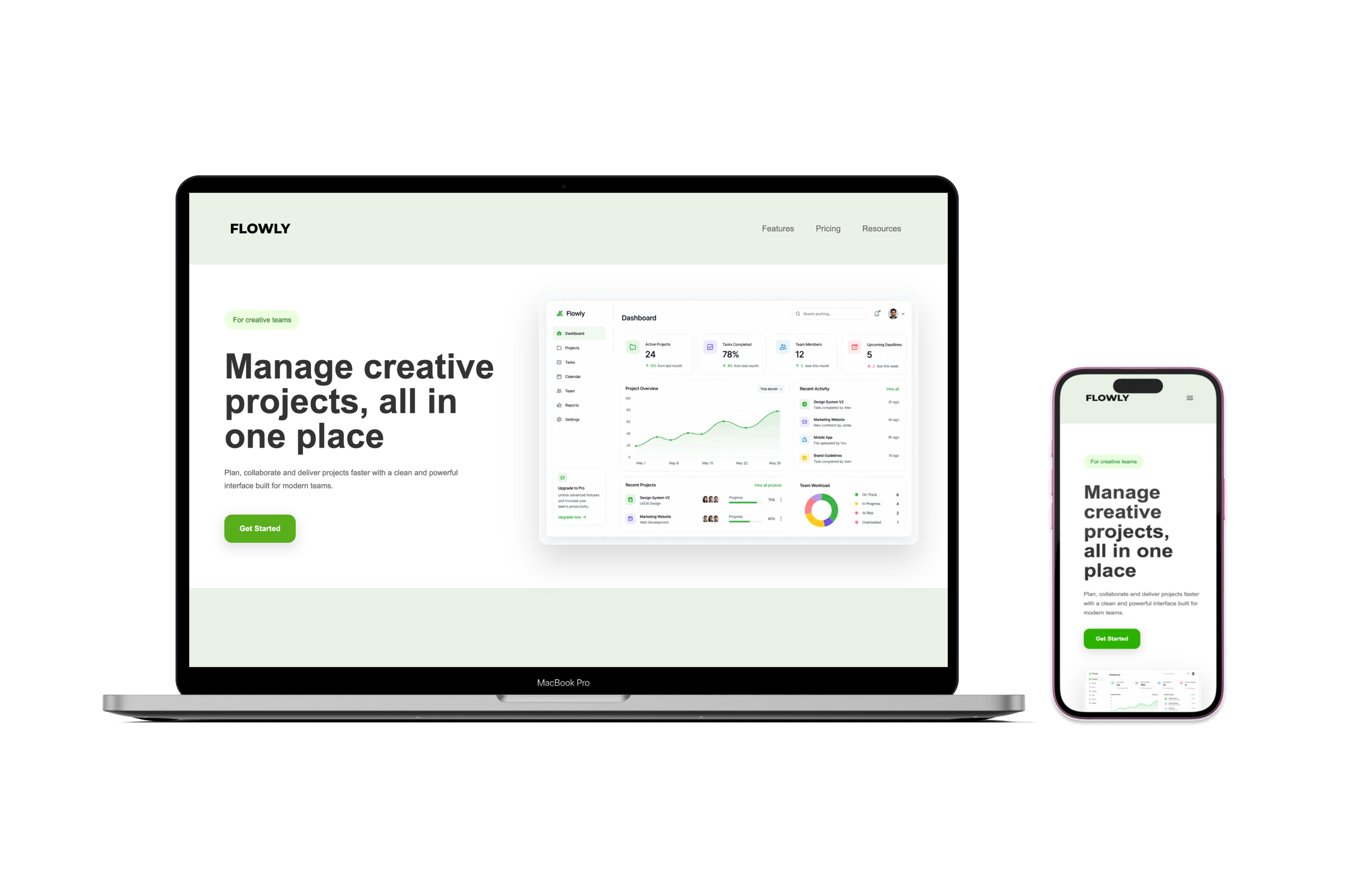
Flowly
A modern SaaS landing page built in Webflow to practice responsive design, layout structure, and visual hierarchy across desktop, tablet, and mobile.
Responsive SaaS Landing Page
Project Overview
Flowly is a page created to practice responsive web design and Webflow development. The project focused on building a clean layout system that adapts across desktop, tablet, and mobile devices while maintaining visual consistency and usability.
Goals
Practice responsive layout design in Webflow
Improve understanding of spacing, containers, and breakpoints
Create a clean SaaS-style visual hierarchy
Adapt the interface across desktop, tablet, and mobile devices
Design Process
Designed the layout in Figma before development
Built the landing page in Webflow using Flexbox and containers
Tested responsiveness across desktop, tablet, and mobile breakpoints
Adjusted spacing, typography, and navigation for smaller screens
Created mockups to present the final responsive interface
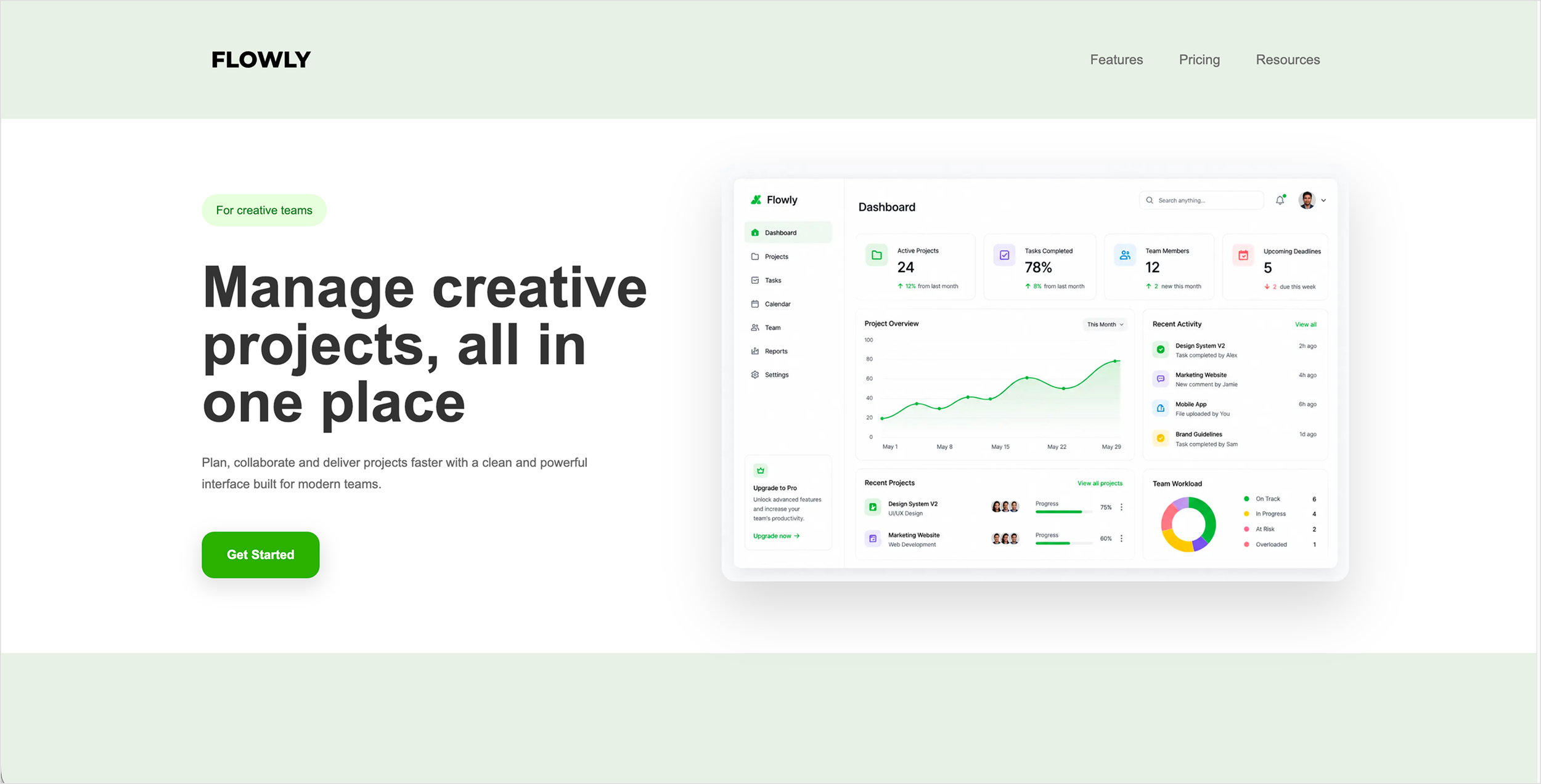
Desktop View
Main desktop layout focused on clean hierarchy, whitespace, and dashboard visibility.
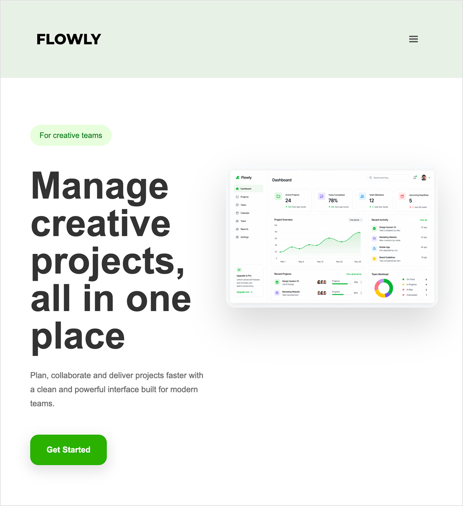
Tablet View
Adjusted spacing and layout structure for medium-sized screens while maintaining readability.
Mobile View
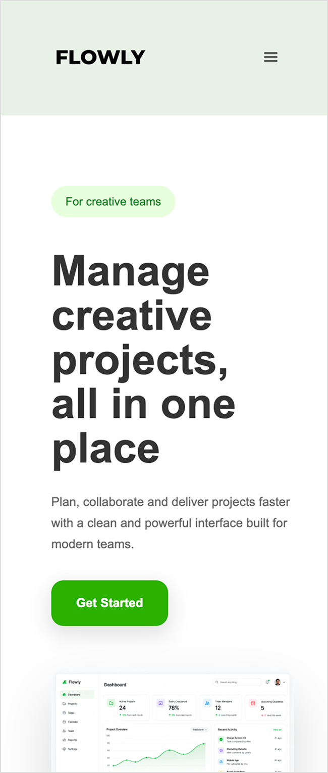
Simplified navigation and stacked content vertically for smaller screens.
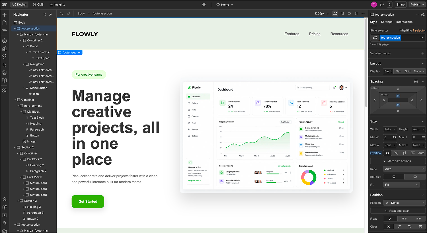
Webflow Development
Built and tested responsive behavior directly in Webflow using breakpoints and Flexbox.
What I Learned
Improved my understanding of responsive web design across desktop, tablet, and mobile breakpoints
Learned how Webflow classes and containers affect layout consistency
Practiced spacing systems, typography hierarchy, and visual balance
Gained hands-on experience building and testing responsive layouts in Webflow